Using the TabColors Property
In another article we highlighted the stunning Color Fill feature that many developers might not have been aware of. Several controls were demonstrated in that article. One example that was not pictured was the SRP Tab control, which will be the focus of this article.
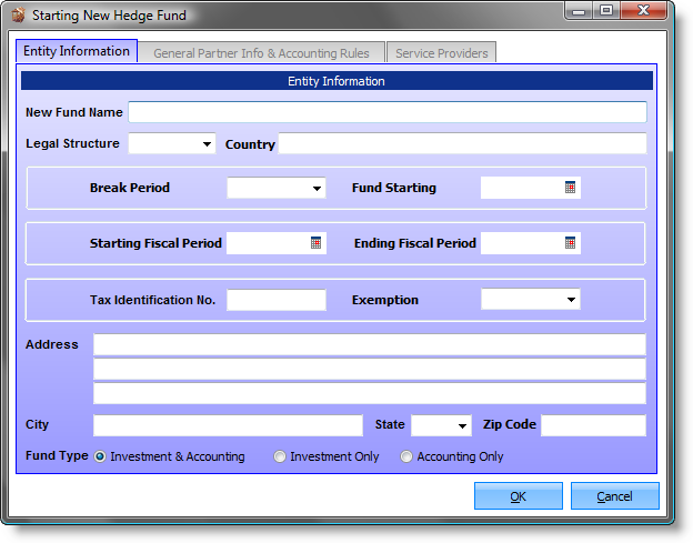
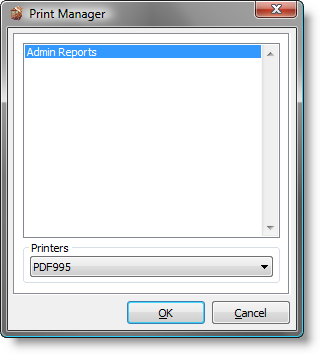
There are two reasons which inspired me to highlight the SRP Tab control. First, being one of our very first ActiveX controls, it has received very little attention in recent years. Second, while doing an application review the other day I came across a window that instantly caught my attention:
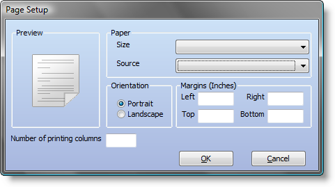
The gradient background made me wonder if this application was being developed in OpenInsight 9.x, since that is when Revelation introduced this feature. This is demonstrated below in the Report Builder Page Setup dialog:
However, I was pretty sure this application was not designed in OpenInsight 9.x. I checked the About box. Sure enough, version 8.0.1. I was then reminded of a color-based ActiveX property that we introduced with little fanfare: TabColors. Therefore, if I had forgotten about this feature in our own controls, it seemed like a good candidate for a new article.
The documentation on this property that comes with our ActiveX controls is pretty thorough. Therefore I will not attempt to duplicate the technical material that it contains. Rather, I hope that this article will present some visual examples that will inspire developers. However, the reader is advised to use discretion when it comes to using colors on such a large scale. I will also make the disclaimer that many of the color examples used below are more for demonstration purposes rather than out of personal preference.
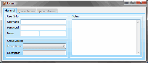
One technique is to color each tab distinctly. This would be used to help the user make quick associations based on the color in addition to the tab caption or position:
Here is the code we used to create the above example:
Ctrl            = @Window : '.OLE_TAB'
Set_Property(Ctrl, 'OLE.AllowXPTheme', No$)
Colors          =
Colors<1, 2>    = 'Vertical(Gradient(LightSkyBlue L=80, LightSkyBlue L=90), Border(LightSkyBlue))'
Colors<2, 2>    = 'Vertical(Gradient(LightSkyBlue L=90, LightSkyBlue L=95), Border(LightSkyBlue))'
Colors<3, 2>    = 'Vertical(Gradient(LightSkyBlue L=85, LightSkyBlue L=95), Border(LightSkyBlue))'
Colors<4, 1>    = 'Gray'
Colors<4, 2>    = 'Vertical(Gradient(Gray L=80, Gray L=90), Border(Gray))'
Colors<5>       = 'Vertical(Gradient(LightSkyBlue L=95, LightSkyBlue L=80), Border(LightSkyBlue))'
Set_Property(Ctrl, 'OLE.TabColors[1]', Colors)
Swap'LightSkyBlue'with'MediumBlue'in Colors
Set_Property(Ctrl, 'OLE.TabColors[2]', Colors)
Swap'MediumBlue'with'Indigo'in Colors
Set_Property(Ctrl, 'OLE.TabColors[3]', Colors)
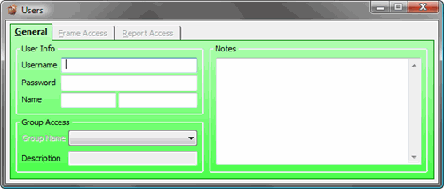
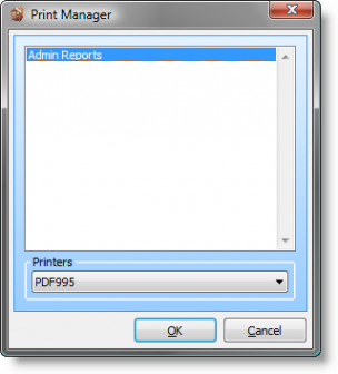
Another use for colored tabs is to make it easier to identify which tab is selected. With some visual themes this can be a little difficult as the selected tab lacks any significant features that make it stand out. In this example we allowed the non-selected tabs to retain their default colors. Only the selected tab and panel were asigned a custom scheme. Additionally we utilized the SelectFont property to make the text bold for further emphasis:
Our code for this technique is a little simpler than before:
Ctrl            = @Window : '.OLE_TAB'
Set_Property(Ctrl, 'OLE.AllowXPTheme', No$)
Set_Property(Ctrl, 'OLE.SelectFont', @SVM : @SVM : 700)
Colors          =
Colors<3, 2>    = 'Vertical(Gradient(Green L=90, Green L=85), Border(Green))'
Colors<5>       = 'Vertical(Gradient(Green L=85, Green L=65), Border(Green))'
Set_Property(Ctrl, 'OLE.TabColors[All]', Colors)
One obvious difference between the gradient features of OpenInsight 9.x and the TabColors feature of the SRP Tab control is that the latter requires an actual tab (if only one) to be created. What if the developer wants the benefit of a gradient background without having to use a tab? With that question in mind we are pleased to announce two new properties that are being unveiled for the first time with this article: CustomPaneColor and FillParentBackground. Before demonstrating these properties let us first look at this window:
You’ll notice that this dialog box has a rectangle that surrounds and highlights most of the controls. The background within this rectangle is nearly white whereas the rest of the form’s background is the defalt system color. This effect is achieved by using the SRP Tab control with no tabs. That is, it is purely there for aesthetic purposes. In this case we are using the AllowXPTheme property so that the entire form remains theme friendly. With the CustomPaneColor property we can now customize how this background will look. For instance, by turning off the AllowXPTheme property (which is necessary for any of the color oriented properties to work properly, see documentation under TabColors for further information), we can now pass in any valid color or color fill setting:
But what if we want to color the entire form with a custom color rather than just a defined rectangle? In other words, what if we want to have the same type of gradient background feature that OpenInsight 9.x supports? One way to achieve this is to size the SRP Tab control so that it is positioned as high as possible on the form and set the Height property to -1 so that it resizes itself (you’ll also want to set the Autosize Width property of the OpenInsight OLE control as well.) This gets pretty close to the mark, but not 100%. Therefore, the FillParentBackground property was created to make this just right. All the developer needs to do is add this property to the existing code and the background fill transfers from the SRP Tab pane onto the form’s background:
In the above examples I used the Select system color. We often use this color to ensure that our forms are theme friendly:
Ctrl    = @Window : '.OLE_TAB'
Set_Property(Ctrl, 'OLE.AllowXPTheme', No$)
Color   = 'Vertical(Gradient(Select L=95, Select L=80), Border(Select))'
Set_Property(Ctrl, 'OLE.CustomPaneColor', Color)
// Disable FillParentBackground to only fill within the Tab control's borders. // Enable FillParentBackground to fill the entire form.
Set_Property(Ctrl, 'OLE.FillParentBackground', Yes$)
For the very creative developer multiple Tab controls can be used for some very interesting effects. One can be used to color the entire background of the form and others can be used as a pseudo-groupbox/panel display:
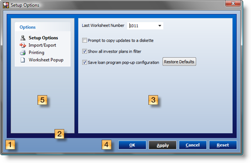
A few notes regarding the above example:
| # | Comment |
|---|---|
| 1 | This is the form background created with the FillParentBackground property. Control: OLE_TAB_BACKGROUND |
| 2 | This is the SRP Tab panel background created with the CustomPaneColor property. Control: OLE_TAB_PANEL |
| 3 | This is the SRP Tab pseudo-groupbox background created with the CustomPaneColor property. Control: OLE_TAB_GROUP |
| 4 | These are SRP Button controls using the Background and Foreground properties. |
| 5 | This is the SRP ShortcutBar control with the Theme property set to WinXP. |
Finally, here is the code for those interested in how this was put together:
// Make the form background a medium blue gradient.
Ctrl        = @Window : '.OLE_TAB_BACKGROUND'
Set_Property(Ctrl, 'OLE.AllowXPTheme', No$)
Color       = 'Vertical(Gradient(LightSteelBlue L=80, LightSteelBlue L=60), Border(LightSteelBlue))'
Set_Property(Ctrl, 'OLE.CustomPaneColor', Color)
Set_Property(Ctrl, 'OLE.FillParentBackground', Yes$)

// Create a panel with a dark blue gradient.
Ctrl        = @Window : '.OLE_TAB_PANEL'
Set_Property(Ctrl, 'OLE.AllowXPTheme', No$)
Set_Property(Ctrl, 'OLE.Height', -39)
Color       = 'Vertical(Gradient(DodgerBlue L=40, MidnightBlue L=20), Border(MidnightBlue))'
Set_Property(Ctrl, 'OLE.CustomPaneColor', Color)

// Create a pseudo-groupbox with a medium blue gradient.
Ctrl        = @Window : '.OLE_TAB_GROUP'
Set_Property(Ctrl, 'OLE.AllowXPTheme', No$)
Set_Property(Ctrl, 'OLE.Height', -52)
Color       = 'Vertical(Gradient(LightSteelBlue L=95, LightSteelBlue L=80), Border(LightSteelBlue))'
Set_Property(Ctrl, 'OLE.CustomPaneColor', Color)

// Create the buttons with a custom normal, hot, and pressed color theme.
Buttons     = 'OK,CANCEL,APPLY,RESET'
Captions    = '&OK,&Cancel,&Apply,&Reset'For ButtonCnt = 1to4
    Ctrl    = @Window : '.OLE_BUTTON_' : Field(Buttons, ',', ButtonCnt)
    Caption = Field(Captions, ',', ButtonCnt)
    Set_Property(Ctrl, 'OLE.Caption', Caption)
    Background      =
    Background<1>   = 'Vertical(Gradient(DodgerBlue L=40, MidnightBlue L=20), Border(LightBlue))'
    Background<2>   = 'Vertical(Gradient(DodgerBlue L=60, MidnightBlue L=40), Border(White))'
    Background<3>   = 'Vertical(Gradient(DodgerBlue L=20, MidnightBlue L=40), Border(White))'
    Background<4>   = 'Vertical(Gradient(DodgerBlue L=40 G, MidnightBlue L=20 G), Border(LightBlue G))'
    Set_Property(Ctrl, 'OLE.Background', Background)
    Forecolor       =
    Forecolor<1>    = 'White'
    Set_Property(Ctrl, 'OLE.Forecolor', Forecolor)
    Set_Property(Ctrl, 'OLE.Font', @SVM : @SVM : 700)
Next ButtonCnt
We hope that these examples encourage you to explore different ways of adding visual interest to your applications.
Leave a Reply